Overwhelmed by web accessibility? You’re not alone. This guide cuts through the confusion, offering clear, actionable steps to make your WordPress site compliant without the stress.
Key Takeaways
- WCAG Color Contrast is Essential: It’s not just about compliance; good contrast boosts user experience, SEO, brand reputation, and helps avoid legal issues.
- Understand AA vs. AAA: Most sites target WCAG 2.1 AA (4.5:1 for normal text, 3:1 for large). AAA (7:1 normal text) is tougher and usually not needed everywhere.
- Contrast Ratios Explained: It’s the measurable difference in brightness between your text and its background. This number directly impacts how easy your site is to read.
- Tools Are Your Friend: Free online tools, browser extensions, and developer tools are your best friends for checking contrast.
- Beyond Text: Don’t forget UI elements (like buttons and form fields) and graphics. They also need a 3:1 contrast ratio.
- Exceptions Exist: Some things are exempt: logos, purely decorative text, and disabled elements, for instance.
- Ongoing Commitment: Accessibility isn’t a ‘set it and forget it’ task. Plan regular checks after updates or new content.
- NuStart Solutions is Your Partner: With 15 years of WordPress expertise and dedicated accessibility services, NuStart offers comprehensive, stress-free help for businesses in Langley, BC, and beyond.
Why WCAG Color Contrast Isn’t Just a Rule – It’s a Necessity for Your WordPress Site
As a WordPress website owner, you might see accessibility as just another checkbox – a daunting, mandatory chore. But what if we told you it’s a strategic investment? Understanding the ‘why’ behind WCAG color contrast isn’t just about avoiding penalties; it’s about boosting your reach, reputation, and search rankings. Let’s uncover the true value.
Enhancing User Experience & Expanding Your Audience
Think about it: good color contrast isn’t just for people with visual impairments. It also helps older users or anyone squinting at their phone in bright sunlight or on an older screen. When your WordPress site’s text is clear and readable, it becomes universally usable and welcoming. You won’t accidentally push away a big chunk of potential customers just because of a design oversight. A better experience for everyone? That means more engagement and a wider audience for your business.
The SEO & Brand Reputation Advantage
Beyond user experience, accessible design—especially proper color contrast—can give your WordPress site a real SEO boost. Google is increasingly focused on user experience as a ranking factor. Sites that are easy for everyone to use tend to have better user signals, like lower bounce rates and longer visits. Plus, committing to accessibility sends a powerful message about your brand. It shows you care, building loyalty and a positive, professional image. Don’t let accessibility oversights cost you organic traffic or brand loyalty. See how a little effort here can really elevate your brand and search rankings.
Avoiding Legal Risks and Penalties
The legal side of web accessibility is constantly changing, and non-compliant websites face serious consequences. In the U.S., courts have made it clear that the Americans with Disabilities Act (ADA) applies to websites, leading to more and more lawsuits against businesses with inaccessible online platforms. Here in British Columbia, legislation like the Accessible British Columbia Act reinforces these same duties. The bottom line? Non-compliance can mean hefty fines, expensive legal fights, and major reputational damage. Protect your business and gain peace of mind by understanding your legal responsibilities, whether you’re in Langley, BC, or anywhere else.
Demystifying WCAG Color Contrast Standards: AA vs. AAA
Technical terms like ‘contrast ratio,’ ‘AA,’ and ‘AAA’ can feel confusing. Which standard applies to your WordPress website? Let’s cut through the jargon and make understanding WCAG color contrast standards simple and actionable for you.
What Exactly is a Contrast Ratio?
So, what is a contrast ratio? Simply put, it’s a number that measures the difference in brightness between two colors right next to each other. For your website, this almost always means your text (foreground) and its background color. A higher ratio means a bigger difference in brightness, making the text much easier to read for people with low vision, color blindness, or age-related vision changes. Imagine white text on a white background – that’s a 1:1 ratio, impossible to read. Black text on a white background, on the other hand, is 21:1 – maximum contrast. Grasping these numbers is key to making your WordPress site readable for everyone.
WCAG 2.1 AA vs. AAA Color Contrast: What’s Right for Your WordPress Site?
The Web Content Accessibility Guidelines (WCAG) set out different levels for color contrast:
- WCAG 2.1 AA (Level AA): This is the go-to standard for most websites. You’ll need:
- A 4.5:1 contrast ratio for normal-sized text.
- A 3:1 contrast ratio for large text (that’s at least 18pt, or 14pt bold).
- WCAG 2.1 AAA (Level AAA): This is a much stricter standard, usually adopted by organizations like government agencies or educational institutions that have a deep commitment to accessibility. For AAA, you’re looking at:
- A 7:1 contrast ratio for normal-sized text.
- A 4.5:1 contrast ratio for large text (again, at least 18pt or 14pt bold).
For most websites, aiming for AA compliance is the practical choice. Hitting AAA across an entire site can really affect your design and be tough to implement without expert help. Unsure which level is right for your WordPress site or what those numbers mean for your specific text sizes? Most aim for AA, and we can help you figure out the best and most achievable compliance level for your site.
Practical Steps: How to Check & Fix Color Contrast on Your WordPress Site
Spotting a contrast issue is one thing; actually fixing it on your WordPress site without breaking something else? That’s where many website owners get stuck. Ready to dive in? Here’s your practical, hands-on guide to boosting your WordPress site’s color contrast compliance.
Essential Tools for Checking Web Accessibility Color Contrast
Good news: you don’t need a Ph.D. in web development to check your site’s contrast! Plenty of tools can help you verify your colors against WCAG requirements:
- Online Contrast Checkers: Websites like WebAIM’s Contrast Checker or Accessible Colors let you plug in hex codes for your text and background colors and instantly see if they pass AA or AAA. Super simple.
- Browser Extensions: Tools like Axe DevTools (for Chrome, Edge, Firefox) or Color Contrast Analyzer (for Chrome) can scan your live WordPress site as you browse, pointing out issues right on the page.
- Design Software Tools: If you’re designing from scratch, programs like Adobe XD, Figma, or Sketch often have built-in plugins to check contrast right then and there.
- WordPress Accessibility Plugins (for scanning): While no plugin can magically fix contrast problems, some can scan your site and flag potential accessibility issues, including contrast.
Feeling overwhelmed by all the options? Don’t be. Start with these recommended tools to quickly identify contrast issues. For a truly thorough, expert audit of your WordPress site, that’s where we come in.
Visualizing Good vs. Bad Contrast: Real-World Examples
It’s one thing to talk numbers, another to actually see what good contrast looks like. Let’s look at some real-world examples to help you make confident design choices.
Bad
Contrast
Example Text
Light grey text (#AAAAAA) on a white background (#FFFFFF).
- Contrast Ratio: 2.3:1
- WCAG AA: Fail (Needs 4.5:1)
- WCAG AAA: Fail (Needs 7:1)
- Why it’s bad: Many users, especially those with visual impairments, will find this extremely hard to read.
Great
Contrast
Example Text
Dark grey text (#333333) on a white background (#FFFFFF).
- Contrast Ratio: 12.1:1
- WCAG AA: Pass
- WCAG AAA: Pass
- Why it’s great: This offers excellent readability and easily clears both AA and AAA standards.
Acceptable for Large Text, AA
Example Text
Medium blue text (#007bff) on a light blue background (#e9ecef) for a headline.
- Contrast Ratio: 3.1:1 (assuming this is large text)
- WCAG AA (Large Text): Pass (only needs 3:1)
- WCAG AA (Normal Text): Fail (needs 4.5:1)
- Why it’s acceptable: This passes AA for large text, but it’s important to note it would fail for normal-sized text. This really highlights the different requirements!
Can you see the difference? These examples should help clarify what passes and fails the contrast tests for optimal, accessible design.
Fixing Contrast Issues in Your WordPress Theme & Content
Okay, you’ve identified the problem. Now, how do you fix it on your WordPress site without accidentally messing up something else? It’s a common concern, but don’t worry – here are practical steps to get your contrast where it needs to be:
- WordPress Customizer: A great first stop! Most modern WordPress themes let you tweak colors directly under
Appearance > Customize. Hunt for settings for body text, headings, links, and background colors. Play with these until you hit those contrast ratios. - Child Theme & Custom CSS: For more precise control, especially if your theme’s customizer is basic, a child theme is your friend. This lets you add custom CSS to override your theme’s default styles without losing your changes every time your theme updates.
- Example CSS (just a snippet):
css
body {
color: #333333; /* Make text darker */
background-color: #ffffff; /* Keep background white */
}

a {
color: #0056b3; /* Darken links */
}
- Example CSS (just a snippet):
- Gutenberg/Block Editor: As you create new content, be mindful of the color settings for individual blocks. The WordPress block editor often gives you color options for paragraphs, headings, and buttons. Always pick colors that contrast well with their background.
- Pick Accessible Themes/Plugins: A proactive tip: when choosing a new WordPress theme or plugin, look for those that explicitly state WCAG compliance. This can save you a ton of remediation work down the line.
- Call in an Expert: If custom CSS feels intimidating, or if your theme is particularly stubborn, don’t hesitate to bring in a WordPress accessibility expert.
Struggling to adjust your theme’s colors or implement these fixes yourself? Our WordPress experts can step in to make those design changes flawlessly and ensure full compliance.
Beyond Text: Non-Text Contrast, UI Components, and Exceptions for Accessible Design
It’s easy to focus solely on text contrast and miss other crucial elements. What about buttons, icons, or those tricky situations where the rules don’t strictly apply? Let’s take your WordPress site’s accessibility beyond the basics. We’ll cover every detail.
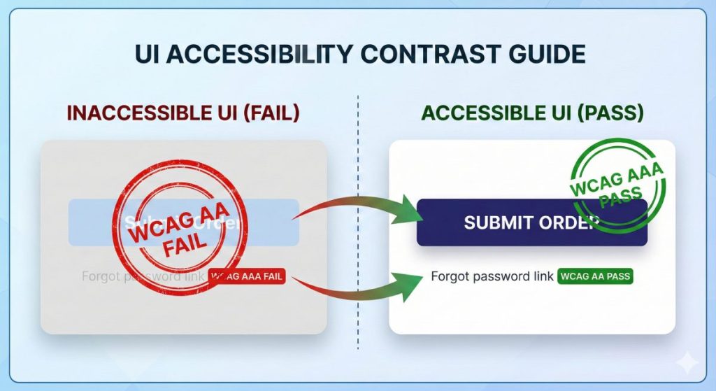
Contrast for UI Components and Graphical Objects
Here’s a common oversight: WCAG contrast rules aren’t just for text. Interactive user interface (UI) components and important graphics also need to meet specific contrast guidelines so everyone can perceive and use them.
- User Interface Components: Think buttons, form fields, checkboxes, sliders, and navigation menus. These need at least a 3:1 contrast ratio against their surrounding colors. Why? So their boundaries, their various states (like when you hover over them or click them), and their overall function are crystal clear. For instance, a button’s border or background needs to stand out enough from the page background.
- Graphical Objects: If a graphic conveys important information—like an icon, chart, graph, or infographic—it also needs a 3:1 contrast ratio against adjacent colors. This ensures people with low vision can still understand the information it’s trying to communicate. If an icon’s meaning is vital, its outline or fill simply must contrast with its background.
It’s easy to focus only on text contrast, but don’t miss these critical non-textual elements! Make sure every interactive piece on your WordPress site is accessible. A comprehensive accessibility audit can help catch anything you’ve missed.
Understanding WCAG Contrast Exceptions (Logos, Incidental Text, etc.)
While WCAG color contrast rules are pretty comprehensive, there are specific exceptions where you don’t need to meet those strict ratios. Knowing these can save you a lot of unnecessary stress and help you avoid compromising your design.
- Logos and Brand Names: Good news! Text that’s part of a logo or your brand name doesn’t have a minimum contrast requirement. The unique styling and recognition of your logo often take precedence here.
- Purely Decorative Text: If text is just there for decoration, doesn’t convey important information, or is part of an image where the text isn’t the main point (like a street sign in a background photo), it’s usually exempt.
- Disabled UI Components: If a button or form field is inactive and you can’t interact with it yet (think of a ‘Submit’ button greyed out until you fill all fields), it doesn’t need to meet the minimum contrast rules.
- Complex Text within Images: If an image contains text (like a detailed chart) but its main purpose is complex, and you provide the same information as actual text somewhere else on the page, the image text might be exempt. Still, it’s always best to offer text alternatives.
Don’t overthink it or stress about elements that don’t need strict contrast. Learning these specific exceptions for your WordPress site will help you achieve accurate compliance without wasting time or resources.
Maintaining WCAG Color Contrast Compliance Long-Term on WordPress
Thinking of accessibility as a ‘set it and forget it’ task? That’s a common trap that can lead to non-compliance down the road. You’re right to be concerned about how new content or updates might affect your site’s accessibility. The truth is, accessibility is an ongoing commitment. Let us handle the continuous WordPress maintenance and ADA compliance, so you don’t have to stress.
Best Practices for Content Creators & Editors
New content is great, but it can unintentionally undo your accessibility efforts if not created with compliance in mind. Your content creators and editors play a huge role in maintaining WCAG color contrast.
- Stick to Pre-defined Palettes: Make sure your WordPress site has a pre-approved, accessible color palette. This way, any new text and background combinations chosen for new content will already meet contrast rules.
- Always Check Before Publishing: Before hitting ‘publish’ on any new page or post—especially if it has custom text colors, colored backgrounds, or images with text—use a contrast checker tool to verify it’s compliant.
- Image Text Needs Contrast: If you absolutely must embed text within an image, ensure it contrasts sufficiently with the image background. Even better? Avoid embedding critical text in images altogether; provide it as actual HTML text instead.
- Consistent Styling is Key: Encourage all content creators to stick to established styling guidelines for headings, paragraphs, and links. This ensures your accessible color choices remain consistent across your site.
We can help empower your team with these best practices, offering training and ongoing support for your content creators.
Theme and Plugin Updates: A Regular Accessibility Check-Up
WordPress is always evolving, with frequent updates to themes, plugins, and the core software. While these updates are vital for security and new features, they can sometimes introduce new styling that unknowingly messes with your site’s color contrast and overall accessibility. It’s a real risk!
- Schedule Reviews: After any major theme or plugin update, make it a habit to do a quick accessibility audit, specifically checking color contrast. Look at your key pages, navigation, and interactive elements.
- Use a Staging Environment: If you can, apply updates to a staging or development site first. This gives you a safe space to thoroughly test for any accessibility issues (including color contrast) before pushing changes to your live site.
- Get Developer Support: Partner with a professional WordPress agency like NuStart Solutions who gets accessibility. Our comprehensive maintenance plans include regular accessibility checks after updates, so your site stays compliant.
Ensure every update enhances, not hinders, your WordPress site’s accessibility. Our comprehensive WordPress maintenance plans include regular accessibility checks.
Why NuStart Solutions is Your Go-To for Stress-Free WordPress Accessibility (and More!)
Need expert help for your WordPress site but aren’t sure who to trust? You’re looking for a reliable, experienced partner who truly understands both WordPress development and accessibility compliance. That’s us. Experience truly stress-free WordPress support and guaranteed accessibility compliance. Give us a call today for a free consultation!
15 Years of WordPress Expertise You Can Trust
NuStart Solutions isn’t new to this. We bring over 15 years of dedicated experience in WordPress development, maintenance, and optimization. What does that mean for you? It means we’ve seen (and solved!) virtually every WordPress challenge imaginable, from complex custom builds to intricate plugin conflicts. Our seasoned team deeply understands the platform’s ins and outs, letting us provide reliable, efficient, and forward-thinking solutions. After 15 years in WordPress, we’ve pretty much seen it all, solved it all, and built it all. You can trust our expertise.
Comprehensive Accessibility Solutions for Your WordPress Site
We’re absolutely committed to web accessibility. NuStart Solutions offers a full suite of ADA & Accessibility Compliance services, all specifically tailored for WordPress websites:
- Thorough Accessibility Audits: We’ll dive deep into your WordPress site, evaluating it against WCAG 2.1 AA (or AAA, if you need it) standards. We’ll pinpoint all accessibility barriers, including any color contrast issues.
- Effective Remediation: Our experts will implement all the necessary code and design tweaks to resolve identified issues. We’ll make sure your site meets compliance without sacrificing its functionality or look.
- Custom Accessible Development: Whether it’s custom themes or bespoke plugins, we build accessibility into the very foundation of your WordPress site from day one.
- Ongoing Monitoring & Support: Accessibility isn’t a one-time thing. We provide continuous support, monitoring, and updates to keep your site compliant as your content grows and regulations shift.
From those initial audits all the way through to full compliance and ongoing maintenance, our ADA & Accessibility Compliance services ensure your WordPress site truly is accessible to everyone. Why not get a free accessibility audit today?
Your Local WordPress Experts in Langley, British Columbia
We’re proud to be a local business right here in Langley, British Columbia, and we’re deeply committed to serving our community. We get the unique needs of businesses in Langley, BC, and the surrounding areas. That’s why we offer responsive, personalized, local support that bigger, impersonal agencies just can’t match. Our local presence means stronger relationships, the option for face-to-face chats when you need them, and knowing you have a trusted partner right in your backyard. For unmatched WordPress support and accessibility solutions here in Langley, BC, NuStart Solutions is your trusted local partner.
Frequently Asked Questions About WCAG Color Contrast
Still scratching your head about WCAG color contrast or ADA accessibility requirements? Don’t worry; our experts are here with clear answers.
Does my logo need to meet WCAG contrast requirements?
What if my brand colors don’t meet the requirements?
– Tweak the Shades: Often, a subtle adjustment to the shade or tint of your existing brand colors is all it takes to hit compliance without drastically changing your brand’s appearance.
– Add Borders or Outlines: For UI components or graphics, sometimes just adding a contrasting border or outline can help meet that 3:1 contrast requirement.
– Use Alternate Text Colors: You can keep your brand’s background color and simply choose an accessible text color that provides enough contrast.
– Create an ‘Accessibility’ Palette: We can help you develop a secondary, compliant color palette specifically for text and interactive elements, while your core brand colors remain for decorative or non-essential uses.
Is there a WordPress plugin to automatically fix color contrast?
Ready for a Truly Accessible WordPress Website?
At the end of the day, WCAG color contrast is a fundamental part of web accessibility. It’s crucial for your user experience, your SEO, your brand’s reputation, and your legal compliance. While these guidelines might seem complicated, achieving and maintaining compliance is absolutely doable with the right strategy and expertise.
Ready to take that definitive first step towards a truly compliant, high-performing, and accessible WordPress website?
Get a Free Accessibility Consultation & Quote
Don’t let WCAG color contrast issues keep you up at night. Contact NuStart Solutions today for a free, no-obligation consultation and a personalized quote for your WordPress site. We offer everything from emergency support and ongoing maintenance to custom development and full ADA & Accessibility Compliance services!
